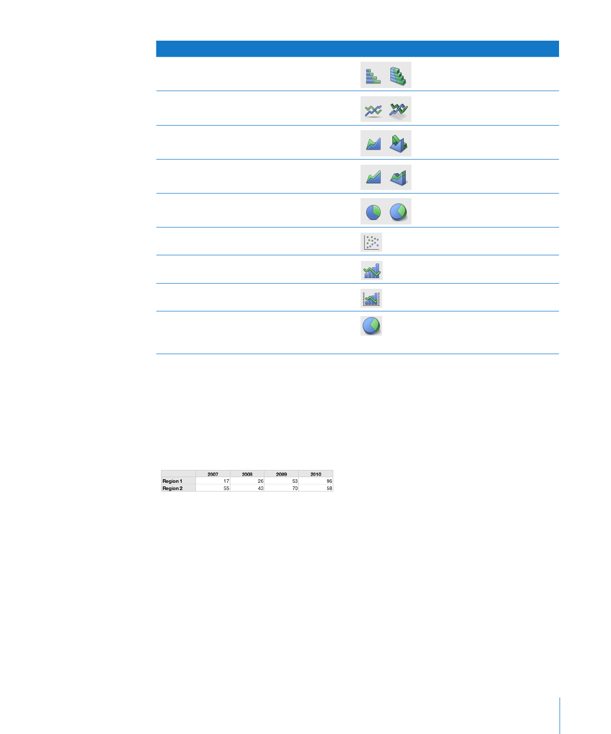
Kind of chart
Icon
Stacked bar
Line
Area
Stacked Area
Pie
Scatter
Mixed
2-Axis
3D charts can be any of the above types,
except scatter, mixed, or 2-axis. Shown here
is a 3D pie chart.
Example
You may want to create a chart that compares how bird populations have changed in
two alpine sampling regions between 2007 and 2010. This data may first be presented
in a table with rows for Region 1 and Region 2. The researcher has counted the
number of birds in each region each year from 2007 through 2010, thus having 4 data
points (or values) for each region.

If you plot this data as a column chart, it looks like the one below:
The data sets contain
one data point (one
bar) from each of the
data series.
The chart legend denotes the
two data series.
In this chart, Region 1 and Region 2 are called the data series because the data
points (numbers of birds) from each region are represented by a series of columns
of the same color, one for each year. Each column for Region 1 is set beside the
corresponding column for Region 2, and each side-by-side set of columns is called a
data set or category (2007 is a category, 2008 is a category, and so on).
To give a different emphasis to your data, you can transpose the data so that data
points are grouped by region rather than by year. In this case, the data points for each
year are represented as a series of columns (data series); in this case each series has
only two data points and the groups of columns for each region are categories. So this
column chart contains two sets of four columns (data points), one category for Region
1 and one data set for Region 2.
The data sets contain one data
point (one bar) from each of the
four data series.
These two bars
represent one
data series.
Data series are represented differently in different kinds of charts:
In
Â
column charts and bar charts, a data series is represented by a series of columns or
bars in the same fill color or texture.
In a
Â
line chart, a data series is represented by a single line.
136
Chapter 7
Creating Charts from Data

Chapter 7
Creating Charts from Data
137
In an
Â
area chart, a data series is represented by an area shape.
In a
Â
pie chart, only a single data set (the first data point in each series) is represented
on the chart (whichever is listed first in the table).
In a
Â
scatter chart, each point on the graph is determined by both an x and a y value.
Two columns of values are plotted as x coordinates and y coordinates on a graph
representing the data points in a single data series.
To learn how to
Go to
Create and edit a chart using data in one or more
tables